So I just took all this information and plug it into a trusty spread sheet and generated some cool graphs and some useless one.
The overall data:
Total Spent on Gas: $2774.37
Total Litres purchased: 3332.845L
Average price of Gas: 83.24 Cents/L
Average Fuel Economy: 10.45 L/100km
Average Fuel Economy: 22.50 Miles/Gallon
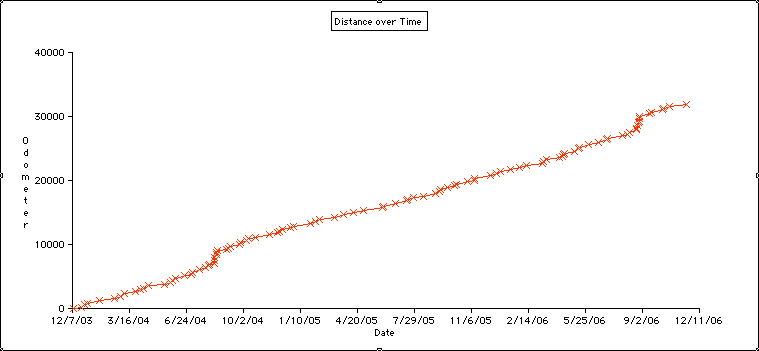
Now for some pretty graphs. The first one is the odometer reading over time. Obviously this one will always go up. What's interesting is that the amount of driving I do is fairly constant as shown by the slope of the graph, except for 2 humps. These hump just happen to be the times I drove to Brickfest in Washington D.C.
 The next graph is fuel economy. This one varies a lot. This is mostly do to driving habits. After some fill-up I'll do lots of highway driving, and after others it will be more city. But I do find it interesting that there appears to be an annual cycle forming. Overall fuel economy appears to be better through the summer and into the fall, the through the winter and spring.
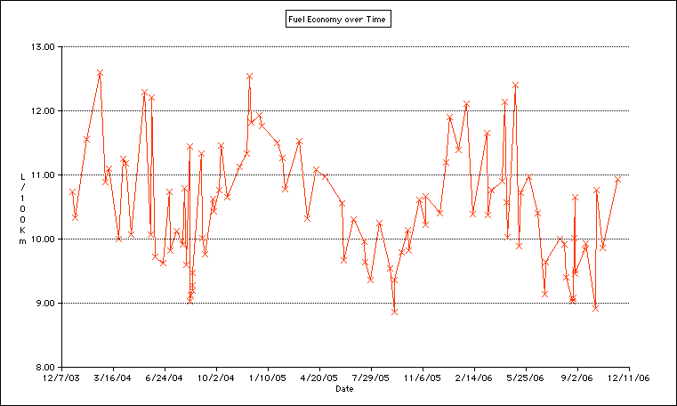
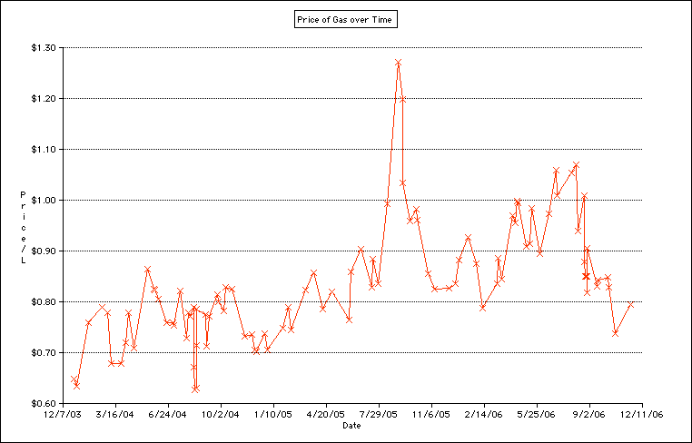
This graph is the price of gas over time. It has nothing to do with my vehicle other then you can see how bad the price of gas was at the end of last summer.
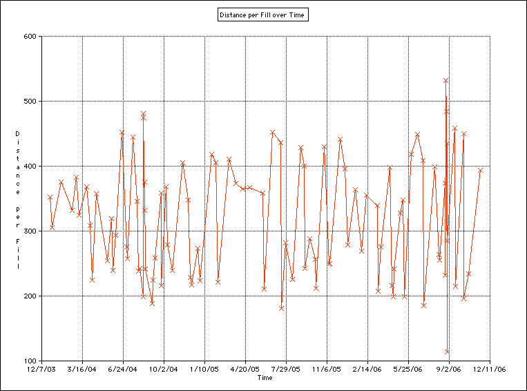
No we get into some silly graphs, like how much gas I put in per fill up. Hmm, just over 2oo km is the minimum, I wonder why that is. I seem to do a lot of driving to somewhere 200km away, fill-up, then turn around and come back.
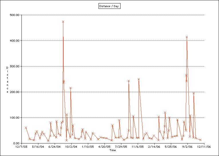
Finally another mostly useless graph. This one shows the average number of kilometres I travel per day for each fill up. The two large spikes are the trips to Brickfest. The next size spikes are most likely quick turnaround trips to that place 200km away.